CSS Container Queries Changed Everything
Container queries let components respond to their parent's size, not the viewport. This is the responsive design upgrade we've been waiting for.
 Team TechCoderUpdated 4 min read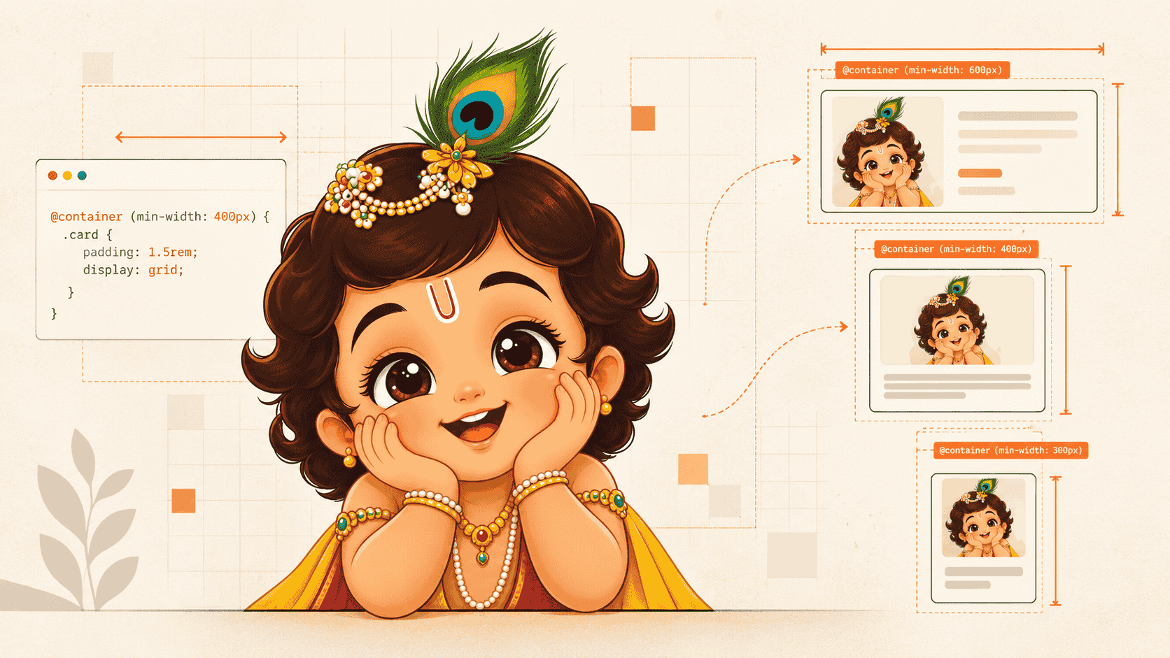
Beyond Media Queries
Responsive CSS has traditionally been built around the viewport. We write a media query for a particular screen width, then change the layout when the browser crosses that breakpoint.
That works well for page-level layouts. But reusable components have a different problem: they don't know or care how wide the viewport is. They care about how much space they're actually given.
A card that's 900px wide on a desktop might become 300px wide when placed inside a sidebar. The viewport hasn't changed, but the component's layout needs to.
That's where CSS container queries come in.
The Problem with Viewport-Based Breakpoints
Consider a reusable card component:
@media (min-width: 768px) {
  .card {
    display: grid;
    grid-template-columns: 200px 1fr;
  }
}
This tells the card to switch layouts when the viewport reaches 768px.
But what if the card is inside a narrow sidebar?
The viewport could be 1440px wide while the card itself has only 320px available. The media query still sees a 1440px viewport and applies the desktop layout.
Container queries solve this by allowing a component to respond to the size of its containing element rather than the viewport.
How Container Queries Work
First, define an element as a query container:
.card-container {
  container-type: inline-size;
}
You can optionally give the container a name:
.card-container {
  container-type: inline-size;
  container-name: card;
}
Now the card can respond to the container's width:
@container card (min-width: 400px) {
  .card {
    display: grid;
    grid-template-columns: 200px 1fr;
    gap: 1rem;
  }
}

@container card (max-width: 399px) {
  .card {
    display: flex;
    flex-direction: column;
  }
}
The important difference is what triggers the breakpoint.
With a media query:
@media (min-width: 400px)
the condition refers to the viewport.
With a container query:
@container card (min-width: 400px)
the condition refers to the relevant container.
That makes components much easier to reuse across different layouts.
A More Useful Way to Think About Them
Media queries answer:
"How much space does the browser have?"
Container queries answer:
"How much space does this component have?"
That distinction becomes particularly useful in component-based applications.
A card can appear in a grid, sidebar, modal or dashboard without needing to know where it has been placed. Its own layout adapts to the space available to it.
Real-World Use Cases
Container queries are particularly useful for reusable UI components.
Dashboard widgets
A widget can switch between a compact vertical layout and a larger horizontal layout depending on the width of its dashboard column.
Reusable cards
The same product, article or profile card can work inside a narrow sidebar or a wide content grid without separate breakpoint logic.
Form components
A form section can use a stacked layout when space is limited and move fields into columns when its container becomes wider.
Component libraries
This is where container queries become especially valuable. A component doesn't need to make assumptions about the application using it. Its responsive behavior can be encapsulated inside the component itself.
Container Queries vs. Media Queries
They aren't replacements for each other.
Media queries remain useful when the page itself needs to respond to the viewport:
@media (min-width: 1024px) {
  .page {
    grid-template-columns: 240px 1fr;
  }
}
Container queries are better when an individual component needs to respond to its surrounding layout:
@container card (min-width: 400px) {
  .card {
    /* Component-level responsive behavior */
  }
}
A modern application can use both. Media queries can control the overall page structure, while container queries make individual components responsive within that structure.
With Tailwind CSS
Tailwind CSS provides container-query utilities, allowing the same idea to be expressed directly in markup.
For example:
<div class="@container">
  <div class="flex flex-col @md:flex-row">
    <!-- Content adapts to the container -->
  </div>
</div>
Here, @container establishes the container and @md:flex-row applies when the container reaches Tailwind's corresponding container breakpoint.
This is particularly useful for component libraries where the same component may appear in very different parts of an application.
Browser Support
Container queries are now supported across current versions of major browsers, including Chrome, Edge, Firefox and Safari. For modern web applications, they are a practical production feature rather than an experimental CSS technique.
As with any browser feature, projects supporting older browsers should still check their specific compatibility requirements before removing fallbacks.
The Bigger Shift
Container queries represent a subtle but important change in responsive design.
Instead of making components aware of the device they're running on, we can make them aware of the space they're actually given.
That leads to more portable components, fewer viewport-specific assumptions and cleaner responsive logic.
Media queries aren't going away. But for component-level responsiveness, container queries are often the more natural abstraction.

Team TechCoder
TechCoder Editorial Team
Independent technology coverage from the TechCoder team, exploring software development, AI, developer tools, gadgets, and the technologies shaping the future.
Get the useful stuff.
Practical engineering, AI and technology insights — without the noise.
Occasional. Useful. Unsubscribe anytime.
Keep reading
 Programming
Next.js 16 + Tailwind CSS v4: Why They Work Well for Modern Blogs
Learn why Next.js 16 and Tailwind CSS v4 are a strong stack for modern blogs, including App Router, Server Components, static rendering, and CSS-first configuration.
 Programming
10 VS Code Shortcuts That Will Double Your Coding Speed
Stop using your mouse. These keyboard shortcuts will transform how you navigate, edit, and refactor code in VS Code.